I've had to research quite a lot to try and find interesting images for my guidebook. I wanted inspiring images and ones that showed the interaction between the sea life and divers. However I was concious of not having too many divers in the shot so that it didn't seem over crowded and so that it didn't look like divers were pestering the animals. Colour was also a big part of my choice. There were several images for cave diving which were muted browns and not very inspiring. The light bursting through the water seems much more magical and that's more appropriate to the tone of the guide.
Tuesday, 14 December 2010
Reference Library
I've had to research quite a lot to try and find interesting images for my guidebook. I wanted inspiring images and ones that showed the interaction between the sea life and divers. However I was concious of not having too many divers in the shot so that it didn't seem over crowded and so that it didn't look like divers were pestering the animals. Colour was also a big part of my choice. There were several images for cave diving which were muted browns and not very inspiring. The light bursting through the water seems much more magical and that's more appropriate to the tone of the guide.
Sunday, 5 December 2010
A selection of images/illustrations that I think are quite interesting

This is quite interesting and relevant to the dice project I was going to do. I like the patterns made by the dots and again the idea of connections

something really simple but curious

by taking paper that is already printed onto and crafting with it this adds a layer of interest

Layering of illustration, experimenting with the opacity of stock. Gives the impression of perspective.


Business cards/stationery

I like how the slant on the format has been carried across all the stationery, also it's a really good way to show the whole range of items in one photograph.


COLOUR
These images have a selection of colours that seem to work really well together. They're all quite subtle/delicate colours that go together


quirky colours, quite fun and fresh


quirky colours, quite fun and fresh


This is so creepy


This idea of camouflage and perspective is something I'd quite like to investigate within my own work.


Dont particularly like the type they've used but starts giving me ideas of what I could do for the Honda brief


This is quite cool. A simple way to put interest into directionals.


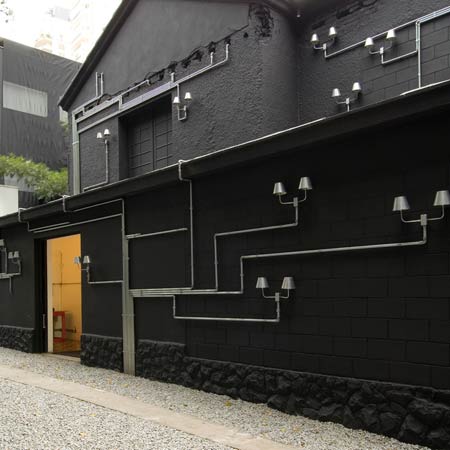
Clever piece of branding for an architect based on the idea of infinite things you can see looking at it. How they've used it within the environment is really interesting, definitely stands out.

Like the 3D styling of this

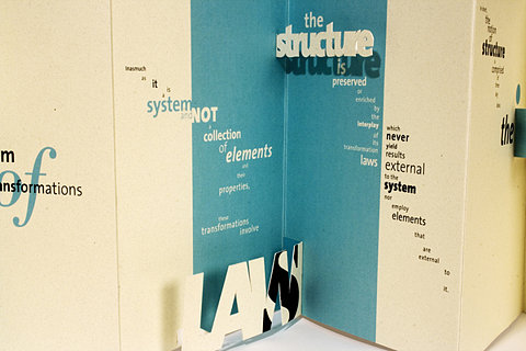
Interesting structure to the diagram, sort of looks like a biological diagram of how things are all connected/how things have evolved etc

like the circle structure to this and that it's actually been made, has a very contemporary feel to it. the colours seem well established yet quirky?

again, very contemporary colour scheme. quite slick.

like the first diagram this looks like a diagram explaining into the connections of things, but theres also a lot of freedom/movement in it


I like the structure of this but I have a real problem with the colour. It seems to really cheapen the design. It seems far too bright and makes the type unreadable. I think perhaps it's just contrast problems?
layouts

another spread from one of the posts earlier, really like the colours and the blocks/shapes used. the page looks like there's lots going on but that it wouldnt take long to read

really like this typeface, it's quite clean/modern and looks like it belongs to the art culture

quite interesting type layout, don't particularly like the image going across though. seems a bit too bulky for the type treatment

quite like this layout, good way to show work. could use this for presentation boards/portfolio


interesting way to caption images and link to body text

detailed embossing


Subscribe to:
Comments (Atom)