A lot of this I'm not really sure whether I like or not. However, for my word "click" I am considering including the motion of clicking - shown by the movement of the word. The way that some of these words "bounce" demonstrates the kind of thing I've been trying to sketch out.
Sunday 6 December 2009
Kinetic Typogrpahy
I thought this was quite a good example of what can be done using flash. All the transformations in this video we've already been taught, so although pretty simple (perhaps) the effects have been used together to create something much more complex. The way that the type adapts in pace really helps to put emphasise on parts of the speech.
Friday 13 November 2009
Packaging
Now that my product is pretty much done I need to decide on how I'm going to package it. To help with this decision I've been looking at how stationery is packaged. Here are some of the examples.

The important point of this packaging isn't the colour scheme or the tone. Because for my aim's it's pretty much the opposite of what I'm trying to acheive. However the structure of it is pretty interesting to think about as an option. Although, I'm effectively going to be packaging a box, unless the contents are lose. If the content's are going to be lose, having a hole in the front probably isn't the best design idea. I also feel a bit uncomfortable about putting a pencil case straight in a cardboard box, that amount of packaging isn't necessary.
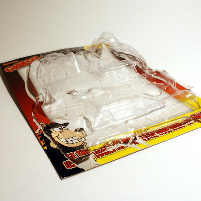
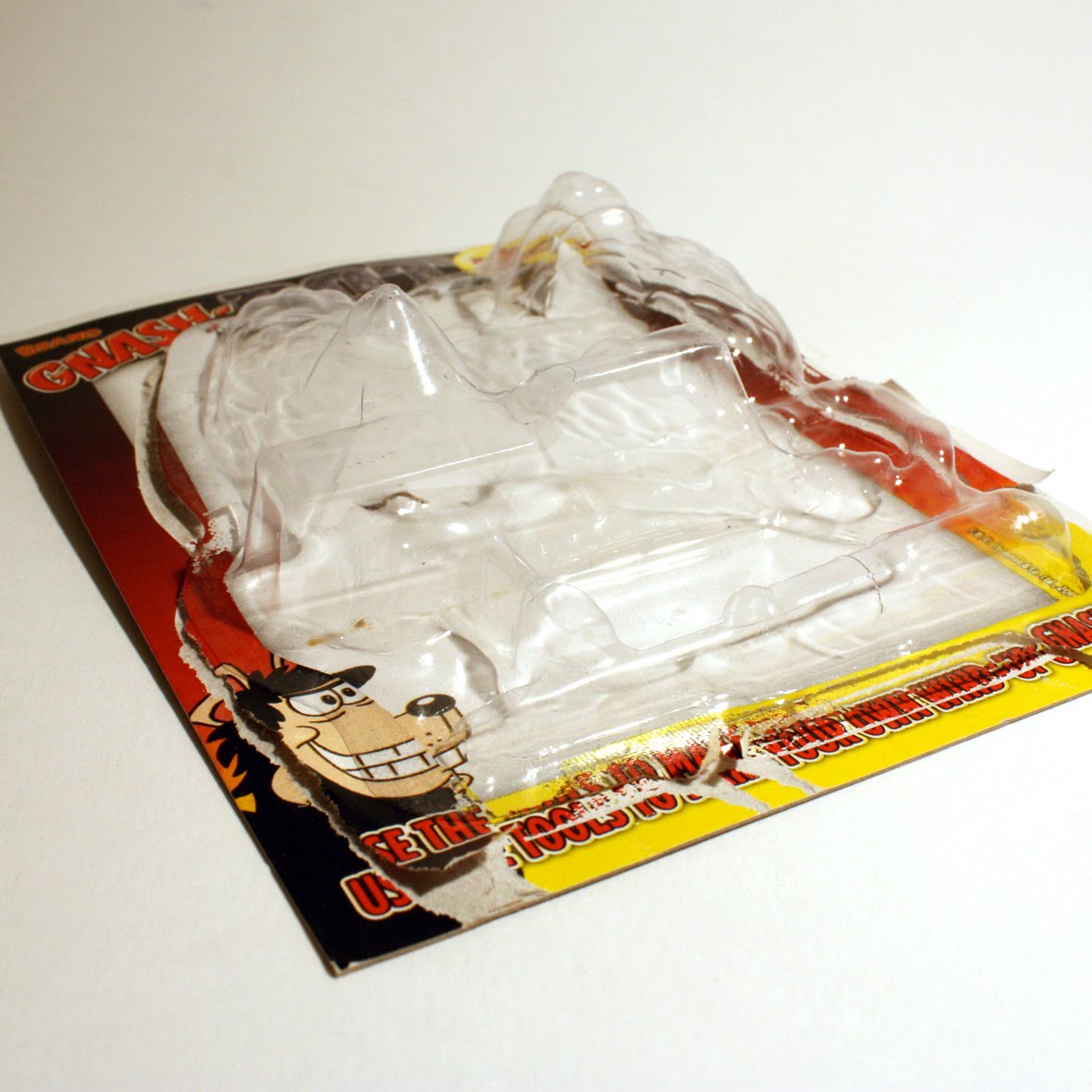
Vacuum packing onto cardboard is a possible option as it allows the contents to be loose and to see what's inside. There are two options of doing this that I can think of, one is vacuum forming the shape of all the objects similar to the example above. Or to vacuum form a basic shape that they will all fit into, like the example below.
Again with this though, it's not really necessary. I don't think vacuum forming the packaging really add's anything to it, other than producing more packaging (which will increase production costs) and being able to see the contents. But there are other ways to achieve that.

Listing the contents of the set seems like something I should include, especially if I do end up with a packaging solution that doesn't allow instant viewing of the contents.

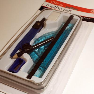
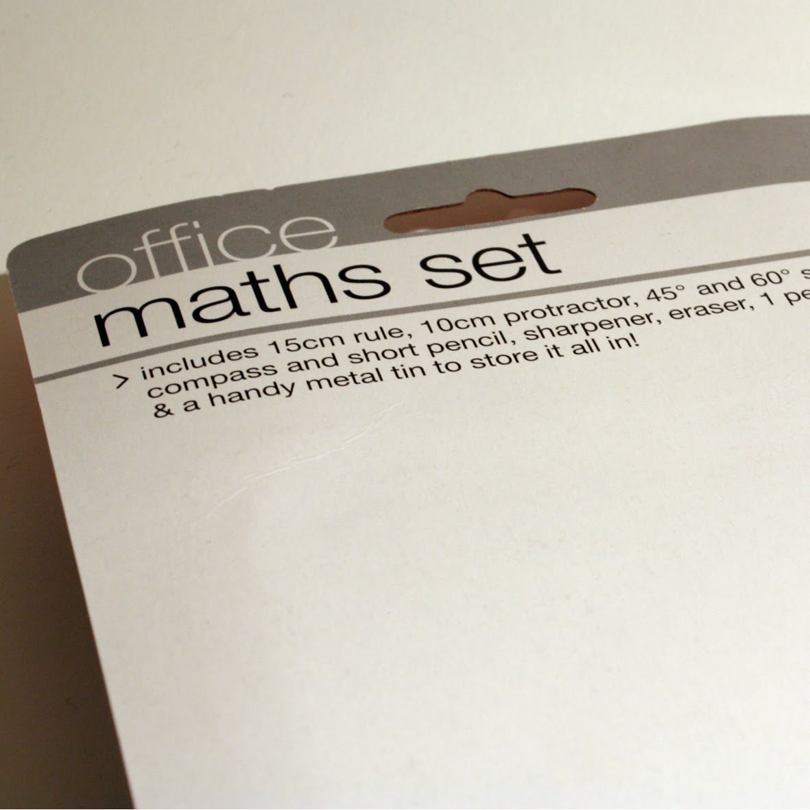
This packaging is probably my favourite of the examples. It's simple, and functional. The cellopgane is something I am keen on, as it protects the objects and isn't bulky. It also allows for the products to be seen instantly.
The way the eraser is packaged I'm also interested in. The use of a wrap around piece of card, which has all the product information on. This offers a place for the branding, allows the product to be viewed and there isn't a lot of it. This is something that I may develop for my product.

The important point of this packaging isn't the colour scheme or the tone. Because for my aim's it's pretty much the opposite of what I'm trying to acheive. However the structure of it is pretty interesting to think about as an option. Although, I'm effectively going to be packaging a box, unless the contents are lose. If the content's are going to be lose, having a hole in the front probably isn't the best design idea. I also feel a bit uncomfortable about putting a pencil case straight in a cardboard box, that amount of packaging isn't necessary.
Vacuum packing onto cardboard is a possible option as it allows the contents to be loose and to see what's inside. There are two options of doing this that I can think of, one is vacuum forming the shape of all the objects similar to the example above. Or to vacuum form a basic shape that they will all fit into, like the example below.

Again with this though, it's not really necessary. I don't think vacuum forming the packaging really add's anything to it, other than producing more packaging (which will increase production costs) and being able to see the contents. But there are other ways to achieve that.
Listing the contents of the set seems like something I should include, especially if I do end up with a packaging solution that doesn't allow instant viewing of the contents.

This packaging is probably my favourite of the examples. It's simple, and functional. The cellopgane is something I am keen on, as it protects the objects and isn't bulky. It also allows for the products to be seen instantly.
The way the eraser is packaged I'm also interested in. The use of a wrap around piece of card, which has all the product information on. This offers a place for the branding, allows the product to be viewed and there isn't a lot of it. This is something that I may develop for my product.
Monday 9 November 2009

For my print solution to this brief I considered a comic strip a suitable option. However, despite enjoying reading comics when I was younger and appreciating the imagery, I was putting off actually producing any illustrations for it, as I didn't feel comfortable drawing the characters. That was until I came across this book "Tim the Tiny Horse" - written and illustrated by Harry Hill. This was really useful to help me develop my approach to the task at hand. The humour used is ideal and the style of illustration makes me feel a lot more comfortable and suits the kind of narrative my book/comic strip will have.

"Little people in the city" is also a useful resource when looking at scale of people in comparison to the environment. However, a lot of the content involves making miniature props which isn't something I'm interested in doing for this brief. Also the humour used is probably not suitable for a younger audience.

This is a stationery set that was given away free with a Dr Who magazine. It's interesting to see how they've used the Dr Who brand across the stationery. This has given me some sort of idea how to approach my branding of the stationery.

I bought these pieces of stationery because they have the ability to be re-branded. Also it's interesting to see how they have approached branding the objects. Unlike the Dr Who example they have used labels and other packaging to do this, whereas the Dr Who stationery was printed straight onto/used stickers. These are two possible approaches I could take.
Wednesday 4 November 2009
Some Print Research

An example of some of the print research I have been doing, taking notes of all the things I'm finding it difficult to remember.

Saturday 31 October 2009
Small is good
For this brief my target audience is Key Stage 2 children, and so I have been looking at how best to communicate to this age group. So far I have been looking at educational websites and anti-bullying websites. I thought it would be a good idea to have a flick through some of the types of publications children read in their spare time, as these are good examples of what children actually LIKE to read. What I'm looking for is what kind of imagery they're using, the language, the format, colours, humour - basically everything.

First up is the Beano. The Beano has been running for years, and so they're obviously doing something right to attract *the kids*. I personally used to read it on the way round Tesco's then put it back and take the Dandy home because the Dandy gave away better stuff. As you can see they're still giving away stuff with the comic, and looking at all the other kids comics and magazines I can't say I remember seeing one which didn't. I have to say I am a bit disappointed in the newest version of the Beano. The stock has changed for one, but also Dennis the Menace looks a lot different to what I remember. Aesthetics aside though, what I loved about the Beano was it's get-one-over-on-the-adults attitude. And reading through it, that's still there.


The next publication I researched was a Dr Who magazine. Like the Beano, it doesn't seem to aim itself at a particular gender, which I also want to avoid. This magazine doesn't use humour to sell it, but instead give's facts and uses a sort of *behind the scenes/exclusive information* tactic. This is useful to look at, in the way that facts are presented to this age group.


I've noticed that both these publications break up the content a lot, everything is boxed off or separated from other content. This is no different than the next example. A book called 1001 gruesome facts.


Friday 30 October 2009
What's out there?

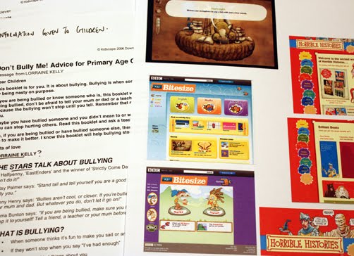
Looking at what anti-bullying material is already out there for children, it's useful in terms of the language they use and the imagery. However I'm not a fan of the tone they use, I realise it's a serious subject but reading through it's pretty depressing. I'd rather approach this more light heartedly and instead of it being right in their face, perhaps a more subtle message.
I've also looked at thing's like Bitesize and Horrible Histories. As a kid I used to love reading these books (in particular Horrible Histories). This wasn't because I had a massive interest in History or anything, it was mainly cause I thought they were really funny and immature and that tone got me more interested in the content. I think this is something I really need to consider with my project.
Thursday 22 October 2009
Selling Space
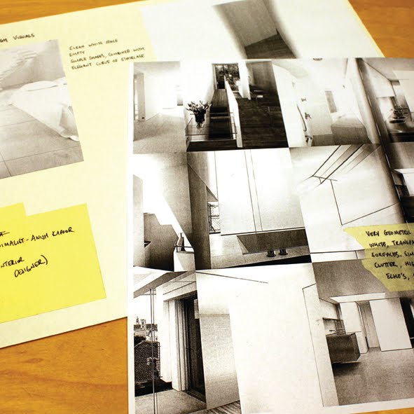
I'm thinking about selling space as a product. To help with idea's about how to package space I'm looking at a lot of minimalist interior design, and analysing how they make space look bigger than it is. So far I've discovered they use a lot of white, transparent and reflective surfaces. Also the shapes used are very cubic.
I've also been looking at what kind of vocabulary is used to sell a space. Looking through property sections I've noted down words that estate agents use to make a space seem like a good investment, it's been pretty interesting - especially realising how every single property is portrayed as being the best one. To be honest after reading about 5 ad's I'd become very cynical and didn't believe a word of it.

Tuesday 20 October 2009
What is good?
Researching into space allowance per passenger on aeroplanes, I came across an article on the Daily Mail website. Described was a new design for the way passengers were seated. Claiming a 50% increase in the amount of passengers able to board and a 30% cut in ticket prices, face to face seating has been suggested.

It is admitted within the article that this is only appropriate for shorter flights, however the costs of these flights in my experience is so low anyway that I'd happily go without the 30% cut if it meant I didn't have spend the journey facing a stranger and competing for the already limited leg room. I'm also ensure about the taking off and landing situation. Does this kind of seating mean passengers will be leaning to their side? With these two parts of the flight being the most dangerous I'm quite interested in the safety of this seating.
Linking this to my "what is good?" concept, I can say at least that if you are short you can keep that little bit further away from whoever is sat opposite you...
Tuesday 29 September 2009
Design For Print Presentation

Design for Print

Gatefolds
A way to include extra/bigger pages in a publication


Throw out
Pretty much the same as a gatefold but just one side

Tip ins
Inserting a different page, usually of different stock/size. Wraps around centre fold and is glued along binding edge.

Tip ons
Pasting something onto a publication using a non-permanent glue, most often used for store cards

Duplex
Bonding two different stocks together

Foil Blocking
Heating foil and transferring it onto another stock

Perforation
Using a shaped blade to cut through parts of the stock

Embossing/Debossing
Pushing through stock to create an indentation or raised area, either with or without foil/ink
Subscribe to:
Posts (Atom)