Tuesday 28 September 2010

Monday 27 September 2010

EES - Website content


For the EES brief I'm working on John has sent me a presentation with some of the content that needs going onto the website, along with a list of other websites for horse jumps. The other websites he considers quite bland and so wants to avoid looking like them. It might be worth going through each of the sites though and look at their content and see what kind of stuff might be useful to include for EES.

Sunday 26 September 2010


I've seen a few of these flow charts and I think they're really addictive. I can't help doing it once, and then start again and take different routes until I've read the entire thing. Some of the stuff on them is so funny as well, it seems like the perfect opportunity to take the piss out of people. Anyway, I was considering for one of my briefs to take problems from forums etc which are renowned for being ridiculous and try to answer them in a series of these flow charts, but I'm thinking that maybe they could be a good way to show my investigations of chance instead.


I've always loved this guys work, it's clever and instant. I love the tone of his work and it's something I'd like to have a go at myself. I think it's important that I develop my image skills this year, I think if I can start to explore more with image it'll help me get back into having more fun with visual things and will feed into everything else I'm doing. Hopefully it'll help me to start having more fun and feel more freedom with layouts. At the moment I feel too restricted, which I completely put upon myself.


I want to look more at infographics, and these seem like a really good way of doing it. Taking the events of films and mapping them, almost like a timeline. This Pulp Fiction one is pretty interesting the way they've used a line for each of the characters and displays their stories.


Inception, seems to be quite a complicated film to some people so using infographics to explain it to people seems like a good idea. Although I've seen inception a couple of times and I don't think I'd understand what this one was trying to say unless I'd understood the film to begin with. I agree that it's clever and a good illustration of the story, but I wonder whether the complicatedness of it is helpful or not. In comparison to the inception infographic below, I know which one I find easier to understand.


This is brilliant. And apparently it actually works. I can't get my head around it, so I'll stick to the cheating method of winning by slightly delaying my responses. But still, this is awesome.


As is this. I really love these examples that clear and funny at the same time.


Friday 24 September 2010

Environmental Graphic Design

SEGD is the Society for Environmental Graphic Design, I've been looking through some of the awards section of their site and picked out a few pieces of design that really inspire me.


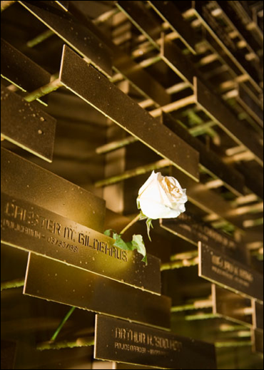
This is a sculpture that acts as a memorial wall for police officers. The structure is very striking, high in impact. Having separate pieces for each name emphasises the amount of names on the wall.


Close up, showing one of the names


A demonstration to how all the surfaces of a place can be used. Here the arrows along the floor act as a trail.


The whole presentation of this reflects well the time of the discoveries, and having the turtles cast and displayed as 3D objects signifies their importance in the theories. The 3D element makes the display much more dynamic.


Again, the 3D aspect makes this seem really dynamic. It isn't the most easily understood piece of information, but structurally is really interesting. I'd like to collaborate with an interior design/architect student so that we could think about interesting shapes/structures to work with that reflect the environment they exist within.


Directionals/way finding within a car park. I like the playful use of perspective, and how colours/lines are used to break up the otherwise mundane space. This is an example of really clever design.


The use of illustration in this temporary store, gives a sense of real delicateness and elegance.


A project from some typography students, each of the letters was hand cut and measured so that it would appear the same height as the letters in front/behind it.