Thursday 21 October 2010


Really like these illustrations/diagrams. I like how dimensions/3D angles have been used, and it's so easy to understand. Although the colours work well together, I'm not too keen on the big circles behind the diagrams. It looks good for the top image and the one of the shoe but the third one it's almost anti-productive. Rather than looking at the diagram my eye is drawn towards the circle.


Interesting example of a flow chart, it's good that they've managed to get an element of personality into something so technical and impersonal.


Interesting way of mapping movement, especially how one position moves into another. It's a good way to show the flow of movement as an overall thing but basically useless if you wanted to know each step.


The idea behind this is brilliant. A really inventive way to measure wind and it's effects on solid objects.


Adding 3D elements into data really intrigues me. On this occasion everything has the same depth, but it might be an interesting way to include more data and use depth as another variable.


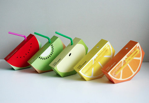
This time 3D objects are the entirety of data representation, it really suits the subject matter too which is less serious and has a sense of fun.


Just a really simple way of making a pie chart more interesting.


Good way of breaking up lots of information and maintaining interest.


This is really good that even though being in a different language you can sort of understand what it's about through the imagery used. This sort of fact sheet might be a good approach for my scuba guide/map


Love how something so fluid and messy as toothpaste has been replicated in this diagram as being solid and blocky.


Very visual and clear way of communicating goals in different years. I think having an example of 3 different years helps to understand each of the individual ones.


Sunday 17 October 2010


Really nice colour palette, very delicate unique sort of feel to the illustrations. Balance between contemporary tones but communicates traditional culture.


This is so cool. I think for the first 5 times of looking at this I didn't realise that people wouldn't be living their lives upside down. If this is a genuine place, I need to go.


The patterns on the wall of this meeting room are taken directly from the companies branding. The same patterns can be found on their stationery. I like the extent to which they're applying their branding.


Such a good way of using packaging. Clear, contemporary, fun


This is also quite fun, and easy to navigate.


Great use of space, design interacting with space.


Everytime I see this I want to shake it's hand. I think this is a brilliant piece of design.


Really like the colour scheme for this and also the neatness of it.


Lots of information on one page and yet it's easily broken down and kept visually interesting, and still maintains the appearance of being part of one thing.


I thought this kind of joining of imagery would work well for the butterfly effect visualisation if I were to go down the illustration route but with using inks.


I like this illustration and thought I could perhaps take it further by using the dots they have used and make them actually represent the events of the film. So rather than a bird the image could be an icon from the film, perhaps a mailbox. (avoiding the obvious of a butterfly)


Nice piece of interactive design. An alternative to standard rsvps


Thursday 14 October 2010


Underwater photography is a big part of scuba diving and I think that it's seeing these views and water to be there that will really interest people in going. I think then, that it's important in whatever deliverables I have that I manage to source some of these photos to include and give people an idea of what the places actually look like. Else it runs the risk of becoming all about numbers and mapping rather than what can be seen there.


This seems like a much more comprehensive selection of ways to categorise which sites are best for diving. Judging each place on specific criteria.


A top 10 article written for the guardian. This seems more like a general destinations top 10 rather than specialising in any particular type of dive.

Wednesday 13 October 2010

Today I spent the day collecting research about scuba diving. Unfortunately all the files I had have now been lost. Just so I don't waste the entire day this is a list of things that I looked at and my thoughts about it. I'll then try to re-collect it and get it uploaded asap.

- top 100 dive sites
- top 10 dive sites
- best sites for eco dives, visibility, walls,
- scuba magazines,
- fact sheets for different areas within red sea
- world ocean map
- different types of dive
- how to qualify to become a diver
- different boards that offer certification

Originally I was thinking of doing a sort of top 10 or top 100 guide but since new things are always changing and they're just a matter of opinion anyway I'm starting to question whether this is a good approach. I also wanted to break down the information into different guides/categories. I had thought about doing this by either types of dives or by country/location. Types of dive seems to be the most useful without causing a mass of information overload but I think it would be useful to be able to see all the different types of dive, within their location at once.

Today I was thinking of producing a world map, which mapped the different areas for different types of diving. See dp for development.


Back to the future timeline...this idea of trying to show the difference of going forward and backwards in time is something I'm trying to figure out myself. At the moment I'm thinking of using a solid line to go forward, since this is the natural movement of time. And a broken line to go backwards, to show the disruption. (see dp)

Thursday 7 October 2010

Web Layouts

I've been looking at different web layouts, so I can think about menu placement and easy navigation.


Menu running along top with large product photo


Product photo central strip with brand name and menu to the side


Open menu along top with options revealed, large photo below


Menu strip cutting through image


Menu/type to left image to right


Menu below image


Roll overs used as image menu


Menu along bottom


Tabbed pages


Strips of image/product photos


Start page before entering site


Photo with menu within frame