
Interesting layout for breaking up information and limited colour palette


Really like the table of information and the colour combination. It looks like something from the days of 'around the world in 80 days'.

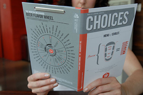
Type going from cover to spine interesting feature

This reminds me of something that Alex showed yesterday, really like the idea of having something this small that's fold away. Probably could use a format like this for my map but not sure how well it would fold especially going down to that size.

The fold out.


Interesting visual, the colour on black makes it look quite electronic

I've included this because it's one of my favourite films and obviously an iconic moment. Just thought it was really clever, reminds me a lot of the rain man poster olly moss did.

Quite interesting curves used


Absolutely love the intricacy of this and how technical it looks. Probably wouldn't ever be able to understand it but visually it's beautiful.


No comments:
Post a Comment