I've had to research quite a lot to try and find interesting images for my guidebook. I wanted inspiring images and ones that showed the interaction between the sea life and divers. However I was concious of not having too many divers in the shot so that it didn't seem over crowded and so that it didn't look like divers were pestering the animals. Colour was also a big part of my choice. There were several images for cave diving which were muted browns and not very inspiring. The light bursting through the water seems much more magical and that's more appropriate to the tone of the guide.
Showing posts with label scuba. Show all posts
Showing posts with label scuba. Show all posts
Tuesday, 14 December 2010
Reference Library
I've had to research quite a lot to try and find interesting images for my guidebook. I wanted inspiring images and ones that showed the interaction between the sea life and divers. However I was concious of not having too many divers in the shot so that it didn't seem over crowded and so that it didn't look like divers were pestering the animals. Colour was also a big part of my choice. There were several images for cave diving which were muted browns and not very inspiring. The light bursting through the water seems much more magical and that's more appropriate to the tone of the guide.

Sunday, 5 December 2010
COLOUR
These images have a selection of colours that seem to work really well together. They're all quite subtle/delicate colours that go together


quirky colours, quite fun and fresh


quirky colours, quite fun and fresh


Interesting structure to the diagram, sort of looks like a biological diagram of how things are all connected/how things have evolved etc

like the circle structure to this and that it's actually been made, has a very contemporary feel to it. the colours seem well established yet quirky?

again, very contemporary colour scheme. quite slick.

like the first diagram this looks like a diagram explaining into the connections of things, but theres also a lot of freedom/movement in it


I like the structure of this but I have a real problem with the colour. It seems to really cheapen the design. It seems far too bright and makes the type unreadable. I think perhaps it's just contrast problems?
layouts

another spread from one of the posts earlier, really like the colours and the blocks/shapes used. the page looks like there's lots going on but that it wouldnt take long to read

really like this typeface, it's quite clean/modern and looks like it belongs to the art culture

quite interesting type layout, don't particularly like the image going across though. seems a bit too bulky for the type treatment

quite like this layout, good way to show work. could use this for presentation boards/portfolio


interesting way to caption images and link to body text

detailed embossing


Saturday, 4 December 2010

Interesting layout for breaking up information and limited colour palette


Really like the table of information and the colour combination. It looks like something from the days of 'around the world in 80 days'.

Type going from cover to spine interesting feature

This reminds me of something that Alex showed yesterday, really like the idea of having something this small that's fold away. Probably could use a format like this for my map but not sure how well it would fold especially going down to that size.

The fold out.


Interesting visual, the colour on black makes it look quite electronic

I've included this because it's one of my favourite films and obviously an iconic moment. Just thought it was really clever, reminds me a lot of the rain man poster olly moss did.

Quite interesting curves used


Absolutely love the intricacy of this and how technical it looks. Probably wouldn't ever be able to understand it but visually it's beautiful.



layouts
Some interesting print layouts, mixture of both type and image.

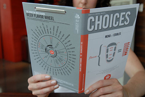
Eventhough there is clearly a lot of text to this layout the designer has managed to break it up really well. Maybe by changing the colour of some of the body copy so that it isn't all one tone. Also by including reverse out block in the center of columns it helps to divide it.

Really clear information, good heirarchy, interesting colour scheme

High end border


Magazine layout, interesting colours, interesting blocks of reverse out and shapes which help to break everything up a bit. Very info graphic feel to it.

Lots of white space, creates sense of expense

Lots of images and some type, very tidy layout, really like this grid

Body copy mainly, using pull out quotes and white space to break up copy

Eventhough there is clearly a lot of text to this layout the designer has managed to break it up really well. Maybe by changing the colour of some of the body copy so that it isn't all one tone. Also by including reverse out block in the center of columns it helps to divide it.

Really clear information, good heirarchy, interesting colour scheme

High end border


Magazine layout, interesting colours, interesting blocks of reverse out and shapes which help to break everything up a bit. Very info graphic feel to it.

Lots of white space, creates sense of expense

Lots of images and some type, very tidy layout, really like this grid

Body copy mainly, using pull out quotes and white space to break up copy
Thursday, 4 November 2010
Photos for scuba guide
I've been trying to find some photographs to include in my scuba guide to accompany the descriptions about each type of dive. I've been looking through scuba diving websites and flickr and come across some really beautiful shots. I really want some photographs that make the landscapes underwater seem like a whole other world and quite mysterious. I much prefer the colour tones which are darker greens and blues. I've got in touch with a couple of the photographers to ask if I can use their photographs and so far one has got back and given me permission to use the photographs as long as it's for non-commercial work and I credit him and am still waiting to hear back from the others.

Photograph of cave diving. What I like about this photograph is that there is an element of wanting to see more. Having the scuba divers within shot is a bit of a teaser because it makes me think about what they could be seeing.

Sea turtles on the reef


I though rather than showing just icebergs for the ice diving or the ice entry point, one direction could be to show the animals that you can see in this area. Although I'm not sure how likely it is that you would see these animals.

Photo from a wreck dive. I quite like the eeriness that the black and white photography conveys but at the same time I don't particularly want just one black and white photograph amongst others which are full colour.

Sink hole/cave. The light bursting through the water is quite interesting but not as nice as the light symphony photograph from an earlier post. Perhaps if there were more variations of colour within it.

Exploring a cave


There's something really magical about this photograph, it looks like the divers are on the search for treasure. It's important that whichever images I choose really represent the possibilities of diving and I think this one definitely does that.
Subscribe to:
Posts (Atom)