Showing posts with label butterfly effect. Show all posts

Sunday, 5 December 2010


This is so creepy


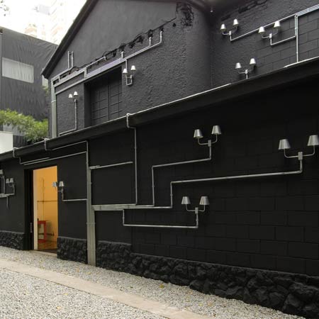
This idea of camouflage and perspective is something I'd quite like to investigate within my own work.


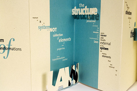


Dont particularly like the type they've used but starts giving me ideas of what I could do for the Honda brief


This is quite cool. A simple way to put interest into directionals.


Clever piece of branding for an architect based on the idea of infinite things you can see looking at it. How they've used it within the environment is really interesting, definitely stands out.


Like the 3D styling of this


Interesting structure to the diagram, sort of looks like a biological diagram of how things are all connected/how things have evolved etc


like the circle structure to this and that it's actually been made, has a very contemporary feel to it. the colours seem well established yet quirky?


again, very contemporary colour scheme. quite slick.


like the first diagram this looks like a diagram explaining into the connections of things, but theres also a lot of freedom/movement in it


I like the structure of this but I have a real problem with the colour. It seems to really cheapen the design. It seems far too bright and makes the type unreadable. I think perhaps it's just contrast problems?

Saturday, 4 December 2010


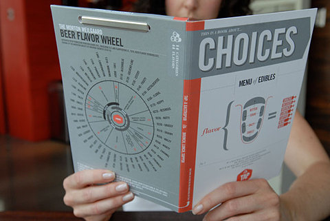
Interesting layout for breaking up information and limited colour palette


Really like the table of information and the colour combination. It looks like something from the days of 'around the world in 80 days'.


Type going from cover to spine interesting feature


This reminds me of something that Alex showed yesterday, really like the idea of having something this small that's fold away. Probably could use a format like this for my map but not sure how well it would fold especially going down to that size.


The fold out.


Interesting visual, the colour on black makes it look quite electronic


I've included this because it's one of my favourite films and obviously an iconic moment. Just thought it was really clever, reminds me a lot of the rain man poster olly moss did.


Quite interesting curves used


Absolutely love the intricacy of this and how technical it looks. Probably wouldn't ever be able to understand it but visually it's beautiful.


Thursday, 21 October 2010


Really like these illustrations/diagrams. I like how dimensions/3D angles have been used, and it's so easy to understand. Although the colours work well together, I'm not too keen on the big circles behind the diagrams. It looks good for the top image and the one of the shoe but the third one it's almost anti-productive. Rather than looking at the diagram my eye is drawn towards the circle.


Interesting example of a flow chart, it's good that they've managed to get an element of personality into something so technical and impersonal.


Interesting way of mapping movement, especially how one position moves into another. It's a good way to show the flow of movement as an overall thing but basically useless if you wanted to know each step.


The idea behind this is brilliant. A really inventive way to measure wind and it's effects on solid objects.


Adding 3D elements into data really intrigues me. On this occasion everything has the same depth, but it might be an interesting way to include more data and use depth as another variable.


This time 3D objects are the entirety of data representation, it really suits the subject matter too which is less serious and has a sense of fun.


Just a really simple way of making a pie chart more interesting.


Good way of breaking up lots of information and maintaining interest.


This is really good that even though being in a different language you can sort of understand what it's about through the imagery used. This sort of fact sheet might be a good approach for my scuba guide/map


Love how something so fluid and messy as toothpaste has been replicated in this diagram as being solid and blocky.


Very visual and clear way of communicating goals in different years. I think having an example of 3 different years helps to understand each of the individual ones.