For this brief my target audience is Key Stage 2 children, and so I have been looking at how best to communicate to this age group. So far I have been looking at educational websites and anti-bullying websites. I thought it would be a good idea to have a flick through some of the types of publications children read in their spare time, as these are good examples of what children actually LIKE to read. What I'm looking for is what kind of imagery they're using, the language, the format, colours, humour - basically everything.

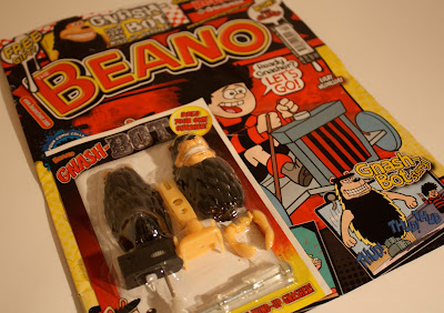
First up is the Beano. The Beano has been running for years, and so they're obviously doing something right to attract *the kids*. I personally used to read it on the way round Tesco's then put it back and take the Dandy home because the Dandy gave away better stuff. As you can see they're still giving away stuff with the comic, and looking at all the other kids comics and magazines I can't say I remember seeing one which didn't. I have to say I am a bit disappointed in the newest version of the Beano. The stock has changed for one, but also Dennis the Menace looks a lot different to what I remember. Aesthetics aside though, what I loved about the Beano was it's get-one-over-on-the-adults attitude. And reading through it, that's still there.
The next publication I researched was a Dr Who magazine. Like the Beano, it doesn't seem to aim itself at a particular gender, which I also want to avoid. This magazine doesn't use humour to sell it, but instead give's facts and uses a sort of *behind the scenes/exclusive information* tactic. This is useful to look at, in the way that facts are presented to this age group.
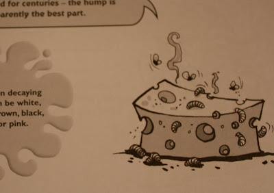
I've noticed that both these publications break up the content a lot, everything is boxed off or separated from other content. This is no different than the next example. A book called 1001 gruesome facts.


No comments:
Post a Comment