Thursday, 27 May 2010


Using these silhouettes is a pretty effective way of showing the design in context and to what scale.


This design is documenting the shape of the moon throughout the year 2000. Again, I like the way this becomes like an obsessive documentation process, and the detail makes it seem like a really authentic piece of design.


The same can be said for this, which details loads of different chairs. There's a real sense of collection which is quite revealing/intrusive.


This is something that I saw and thought might be a useful method for my information leaflet to separate information per zone. Now that I look back on it though I actually don't think it's very engaging. That could be purely down to colour choice.

Wednesday, 26 May 2010

Imagery used for research

A sample of the imagery I have collected over the project which has helped me produce visuals.
The majority of the images came from either the Natural History Museum or National Geographic.


Monday, 17 May 2010


An example of way finding within the context of a school. I'm impressed at how much impact this design has, despite being on a surface that I doubt would otherwise get much attention. This idea of using the floors and ceilings for directional purposes is something I really want to try and push.

Sunday, 16 May 2010


Another example of how cubes can be used as a form to be printed on. This example separates the information of each floor. The NHM could be categorised this way, or by zone, so is an idea to consider.


Using lines on the floor to direct people around a space, this time the lines are colour coded. I could use a similar method to show the way towards zones. Although here they just seem to be lines and although it may indicate a route it isn't clear which direction to follow it.


I really like how this signage uses the corner of a wall. The fact that a section of the sign is removed to reveal the wall is something I haven't seen before. I'd quite like to do something like this myself.


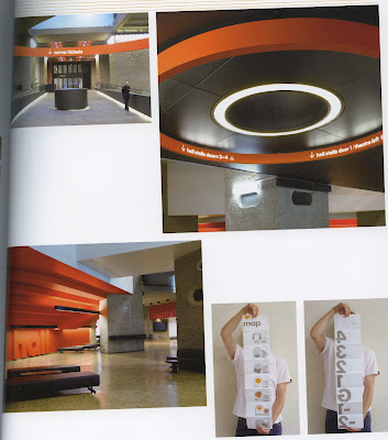
Here I'm interested in the structure of the circular signage. It gives it a really contemporary feel. Probably not suitable for the NHM but could work really nicely for other galleries/museums. Also I'm interested in how the map folds out and has one floor per page. I wish I'd seen this before so that I could try this for my own map design, but at this point in time I don't think I can justify spending the time redesigning my map and still be able to fully exploit the opportunity for other deliverables.


Using actual icons on the floor as a method of way finding.

Friday, 14 May 2010

Some interesting examples of way finding around public spaces. I think this is a really important part to my brief, and is an important visual reminder to visitors where they are going.


I really like this example of way finding, I'm not really sure what the numbers correlate to but it's so intriguing and sort of pulls the eye down the corridor. The numbers become almost obsessive like taxonomy.


Using the floors as a method of direction is pretty interesting. It seems a more persuasive way of leading someone somewhere rather than being purely directional. The fact that there isn't actually any indication into what you're following is exciting, as though your on a treasure hunt or something.


I don't particularly like the type on this signage, but adding the twist into the structure of the sign itself draws the eye in. I've done something like this before with metal, and it's just a case of twisting the metal and then joining it so I don't think it's out of the question producing something like this.


Although just a simple number, the scale and form of it suddenly makes this seem so much more.


I really love this. Just adding type to a 3D structure makes it so much more dynamic and visually engaging.


Thursday, 13 May 2010


Again, this visual style is really authentic but the colours are very 1970's. Also the legibility of the map is a struggle for me.

I'm not actually sure whether this is mapping anything or whether it's just a graph of some sort. Either way, I like the coloured blocks used in combination with data. I also quite like that it exists on a black background with the information reversed out. I don't particularly think this would suit the identity of the Natural History Museum, but still it's an interesting aesthetic.


This key looks as though it's come from the 1940's. The separation between the legend/index is pretty interesting. This kind of aesthetic is really interesting but it's too dated for NHM, if I were to design in a ironic/old sort of way I think I'd need to push it to an extreme since the NHM is famous for how old the majority of their collection are. To have something that resembles 1940's and present it as 'old' would, to me, seem like a joke.

Wednesday, 12 May 2010

Maps

Since I'm re-organising the museum it's important for visitors to know exactly where the new zones are. One of the obvious ways of doing this is to provide a map. Designing maps isn't something I'm familiar with at all, and my general spacial awareness is quite poor. I've been looking at a few books which have loads of examples of different ways of mapping, I didn't realise how many options there were.


I like that this map is split up into different floor, and positioned above/below other floors. It makes it easier to see the relation between rooms. This would be a really useful technique to use for the museum, since it's made from several floors and buildings.


This type of map is a lot more complex, and more like an architects model. The model is used in combination with photographs of the real building and a key. This is a really nice way to visually represent the building, and would communicate well to those who aren't as proficient in reading the more common version of mapping. It would perhaps be useful for the younger visitors.


I like this 3D way of mapping, the building are simplified well and yet it's still apparent which bits are rooms and which are buildings. The colour coding of text boxes at the side is something to be considered however I think if I used this method I'd try to be more subtle. The lines in particular are distracting rather than helpful.


This is an interesting application of icons, this could be developed into a really interesting map, however due to the size of the museum/amount of icons I fear that it would be more of a hindrance than a help when it came to my brief.

Saturday, 8 May 2010

Photos of NHM

Dan Boome kindly gave me a copy of some of his photo's from the Natural History Museum. Here are some of the photo's from the blue zone and the green zone.