
Another example of how cubes can be used as a form to be printed on. This example separates the information of each floor. The NHM could be categorised this way, or by zone, so is an idea to consider.

Using lines on the floor to direct people around a space, this time the lines are colour coded. I could use a similar method to show the way towards zones. Although here they just seem to be lines and although it may indicate a route it isn't clear which direction to follow it.

I really like how this signage uses the corner of a wall. The fact that a section of the sign is removed to reveal the wall is something I haven't seen before. I'd quite like to do something like this myself.
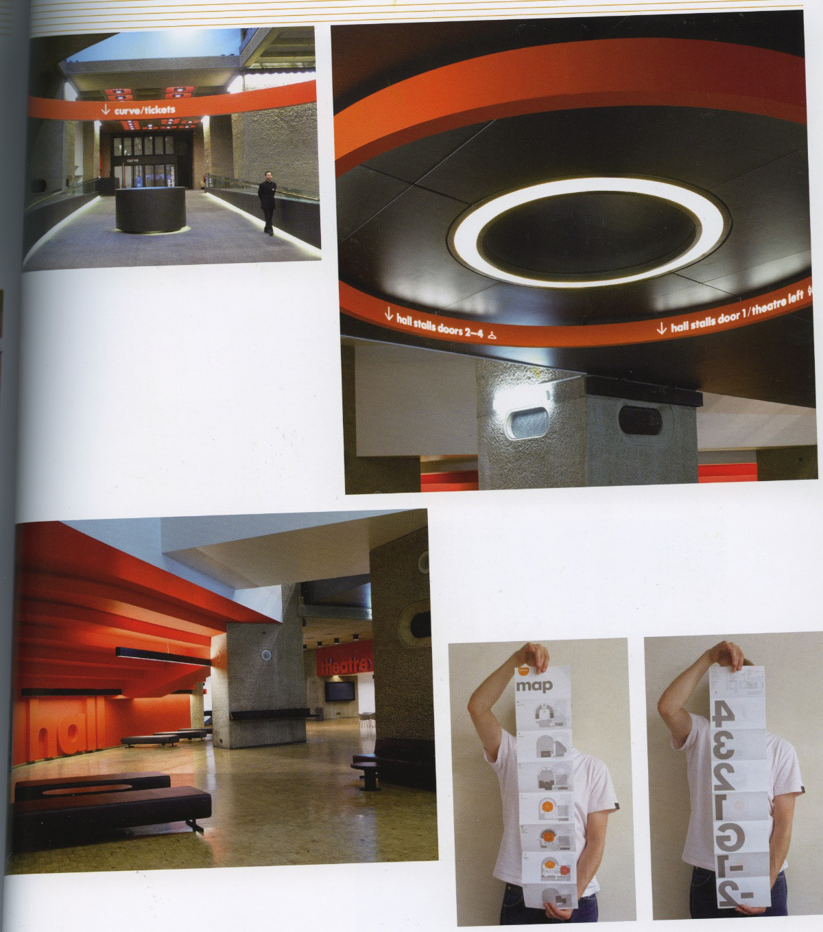
Here I'm interested in the structure of the circular signage. It gives it a really contemporary feel. Probably not suitable for the NHM but could work really nicely for other galleries/museums. Also I'm interested in how the map folds out and has one floor per page. I wish I'd seen this before so that I could try this for my own map design, but at this point in time I don't think I can justify spending the time redesigning my map and still be able to fully exploit the opportunity for other deliverables.

Using actual icons on the floor as a method of way finding.
No comments:
Post a Comment